APEX
Editorial

Buon Natale
Italian Christmas card set
Each card features a unique Italian tradition along with a traditional recipe.

Confessions
Book cover
A three book series of short stories with glimpses into intertwined lives.

Daiwa
Identity
Logo and letterhead for a Japanese-U.S. bank. The two halves represent the different countries and reflect the Japanese flag.

Eclectic
Identity
Identity and promotion items for a night club.


Jeff Brice
Collateral
Brochure for artist Jeff Brice to promote his latest works.

Posters
Various posters


Olympus
Packaging
High-end olive oil packaging. A minimal label allows the purity of the oil to shine through.


Reunion Watches
Identity
Logo and letterhead for a family-owned watch company.


Velocity
Identity and Furniture design
Based on the Futurism movement, this chair was inspired by a piece of sculpture and the catilevered design reflects the balanced tension of the movement.

Wayfinder
Identity
An interactive tool for library visitors to quickly find the book they're looking for.

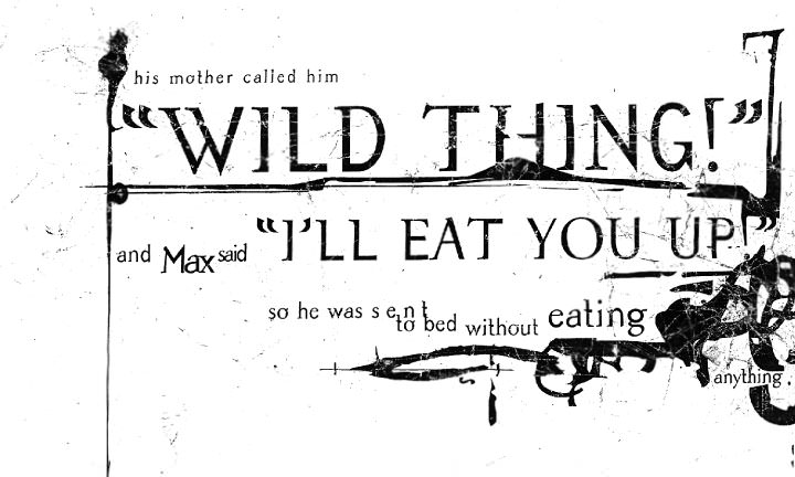
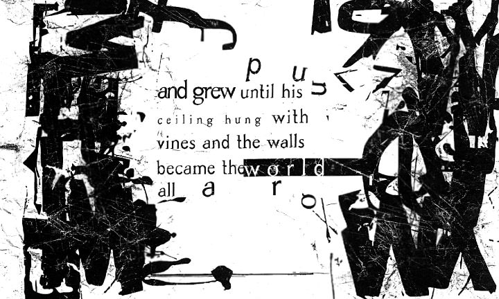
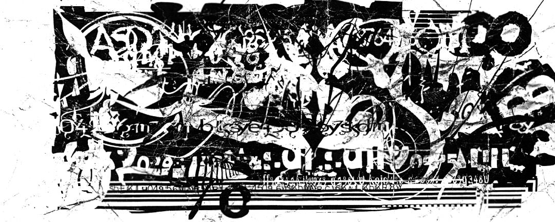
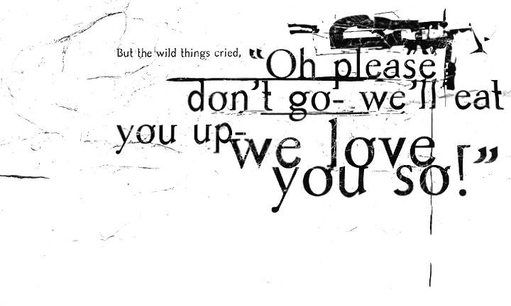
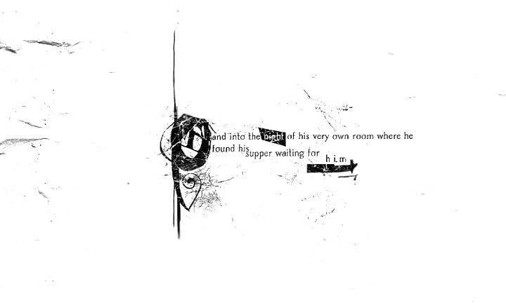
Where the Wild Things Are
Typography and Book Design
Take our favorite children's story and reinventing it through typography using only 2 typefaces.
flip through


